Shanghai
1. Bus stops and boundary
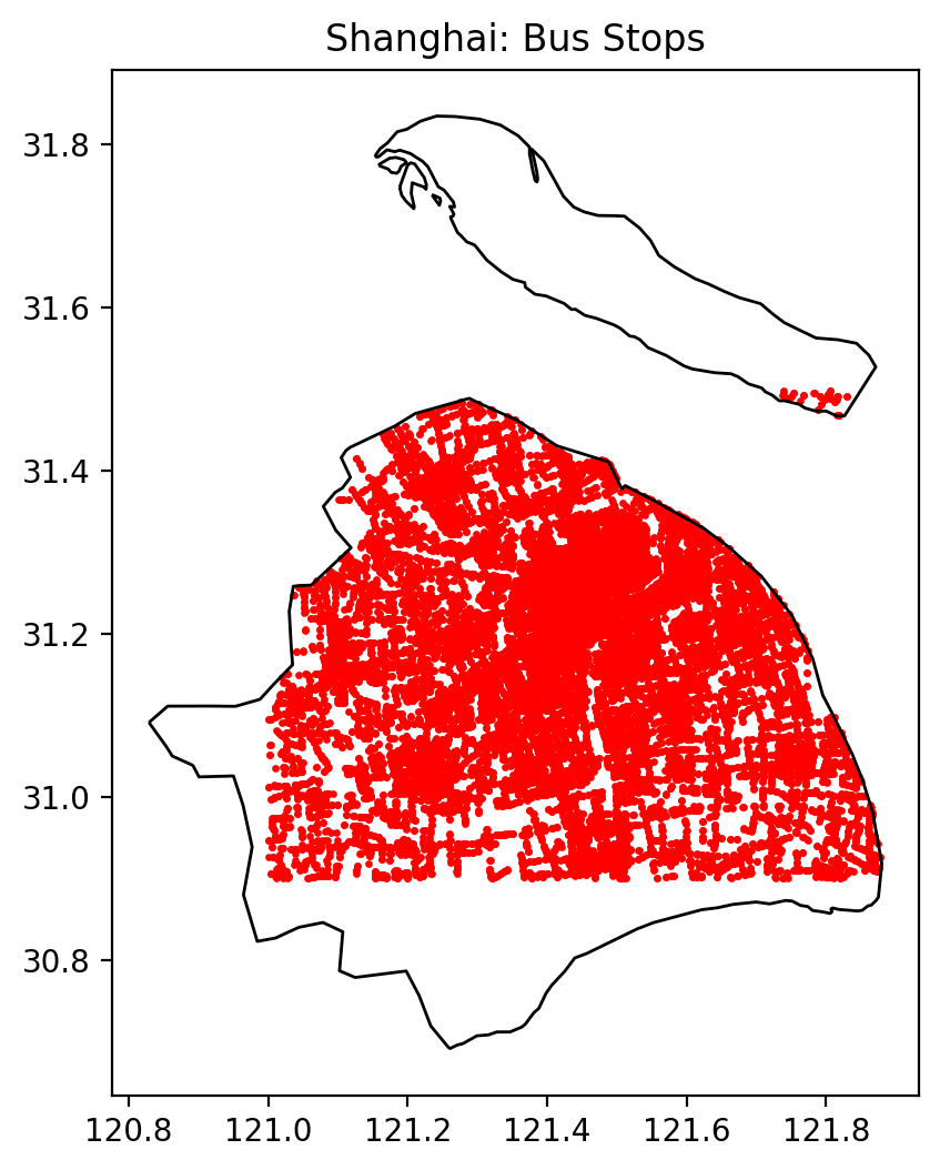
The point map shows an extremely dense web of bus stops across Shanghai’s main urban area. Coverage is close to continuous in the historic Puxi core and along major corridors extending towards the south and southeast. By contrast, the western and southern edges of the polygon appear more weakly served, with clearer gaps between linear clusters of stops.
A key data limitation is visible here. The boundary used for Shanghai comes from an open-data administrative layer and represents the entire municipality, including the main urban area and outlying islands such as Chongming. As a result, the reference area contains substantial amounts of water, port land, industrial space and peri-urban green space that are only sparsely served by buses.
This choice has two implications:
- Some land inside the boundary is not actually urbanised, which dilutes density metrics (stops per km²) relative to the intensity of development.
- “Outlying districts and islands are included in the reference area, but many of them have very low stop density, which pulls down the citywide averages. The maps visually focus on the metropolitan core where most stops are concentrated.”
These caveats are important when interpreting the comparative results: Shanghai’s bus system appears less dense than Singapore or Amsterdam partly because its reference area is larger and more heterogeneous.
2. 500 m Euclidean coverage
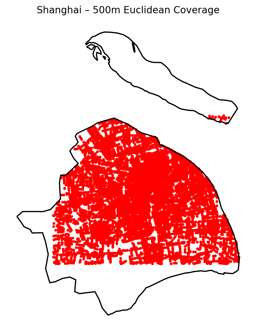
The 500 m coverage map shows that most of the built-up portion of the polygon lies within walking distance of at least one bus stop. In the central districts the red dots (stops) sit inside an almost continuous field of buffers, especially along the north–south spine of Puxi and across the eastern “fan” in Pudong.
From the summary table, Shanghai’s Euclidean 500 m coverage ratio is about 0.475 – that is, roughly 47.5% of the boundary area lies within 500 m of a stop, corresponding to about 3,855 km² of land. This is somewhat lower than the 55–57% coverage found for the other cities, but still substantial given Shanghai’s very large total area (8,115 km² in this definition) and the amount of non-urban land included in the polygon.
Two points are worth noting:
- Within the continuous built-up core, Euclidean coverage is extremely high; the lower citywide ratio is largely driven by agricultural land, wetlands and industrial zones along the edges.
- Because Euclidean buffers ignore street topology, they may overestimate walkable access in places with barriers such as waterways, fenced compounds or limited crossing opportunities.
3. 500 m network-based coverage
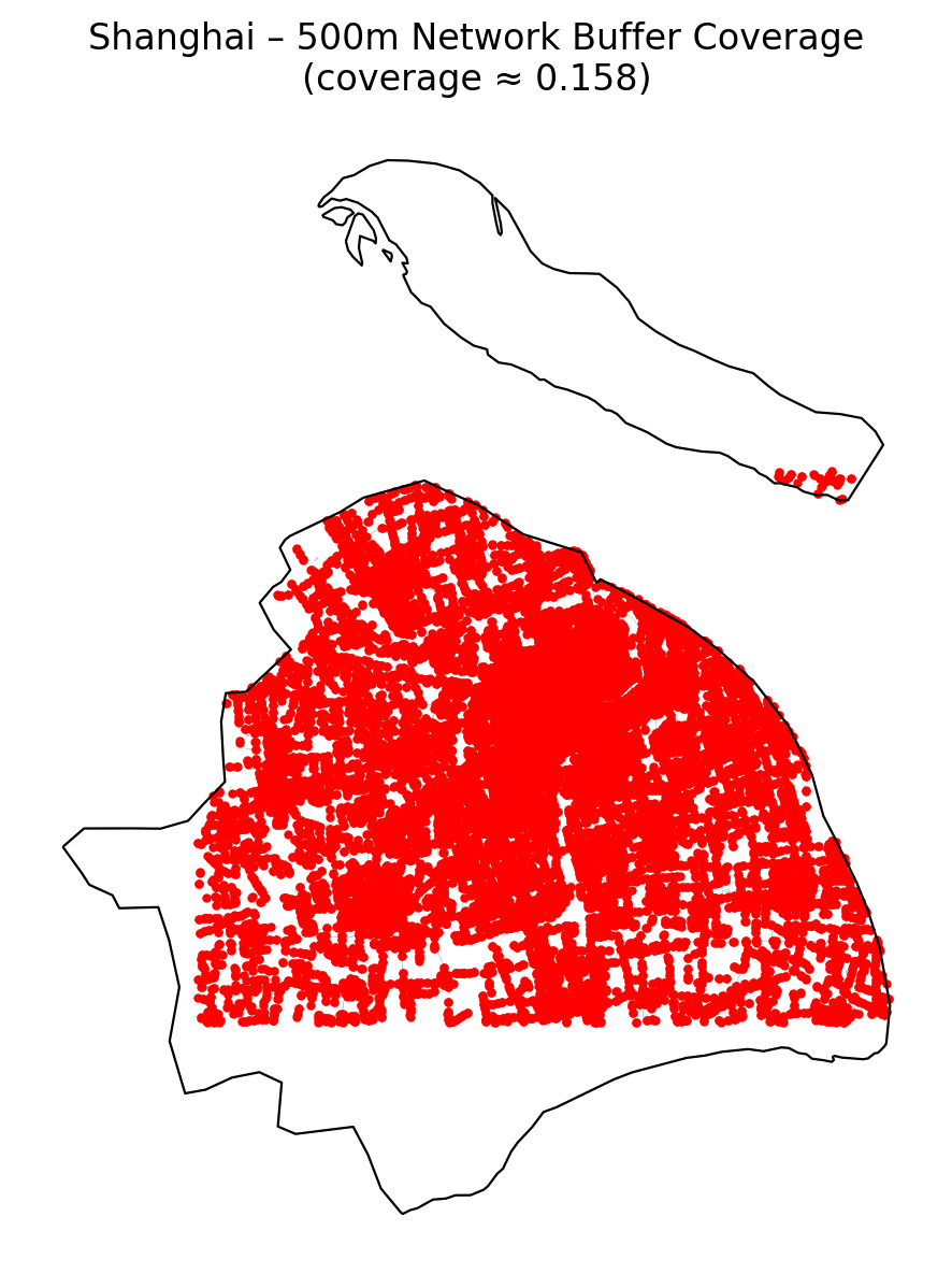
To address the limitations of straight-line distance, a second indicator uses network-based walking distance along the OpenStreetMap street graph. Here, for each bus stop, all street segments reachable within 500 m walking distance are buffered (with a small lateral offset to turn lines into walkable “corridors”) and merged into a single coverage polygon.
For Shanghai this network-based 500 m coverage ratio is about 0.158 – only 15.8% of the boundary area (≈ 1,281 km²) lies within 500 m along the street network of any bus stop. The contrast with the Euclidean value (47.5%) is substantial and highlights two features of the urban structure:
- Many apparent gaps in the Euclidean map are in fact hard to reach on foot because of expressways, rail yards, rivers or superblocks.
- Walkable coverage is concentrated in a denser inner band, while the outer edges contain long, corridor-like routes with widely spaced intersections and limited sidewalk connectivity.
Why do the three Shanghai maps look so similar?
Visually, the bus-stop map, the Euclidean coverage map and the network coverage map all appear as a dense red “blob” covering the same main urban area. There are three reasons:
- All three figures plot exactly the same set of bus stops and the same boundary, so their overall outline is identical.
- In the dense core, both Euclidean and network buffers overlap heavily, producing a solid red patch in all maps – small differences in coverage are hard to see at city scale.
- The network-based coverage is drawn with a relatively thick buffered corridor around reachable streets; when many corridors overlap, the result again looks almost solid.
The key differences therefore lie in the numbers rather than in the visual impression: 47.5% Euclidean vs. 15.8% network-based coverage. This becomes an important limitation when using maps for communication: they can suggest “full” coverage even where the network-based indicator shows that effective walkable access is much more restricted.
4. Kernel density heatmap
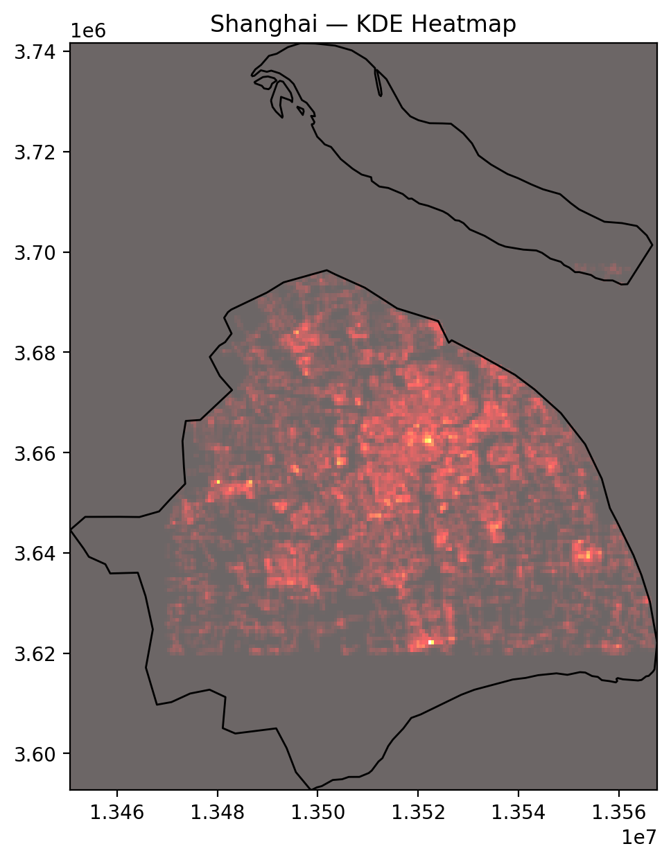
The KDE heatmap reveals the internal hierarchy of Shanghai’s bus stop network. High-intensity “ridges” of density run:
- north–south through the historic core of Puxi, roughly aligned with major arterial roads and metro corridors;
- east–west towards the inner ring and Lujiazui, capturing the radial orientation of routes feeding the central business district;
- southward towards emerging sub-centres and new towns.
Unlike Amsterdam, where density peaks are tightly clustered around a relatively small inner core, Shanghai exhibits a broad plateau of medium–high density punctuated by multiple hotspots. This pattern is consistent with Shanghai’s role as a polycentric megacity, where employment and activity are no longer confined to a single CBD.
When compared with Singapore’s heatmap, Shanghai looks less uniformly bright: Singapore’s island-wide planning and strong trunk–feeder structure produce an almost continuous field of high density. In Shanghai, historic street grids, redevelopment patches and industrial belts introduce more variability, with some corridors substantially better served than adjacent neighbourhoods.
5. Nearest-neighbour distances
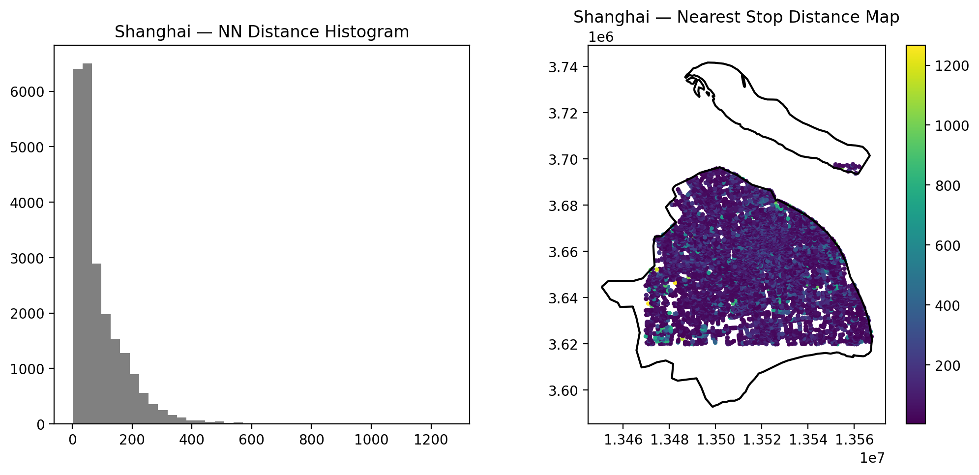
The nearest-neighbour (NN) histogram for Shanghai is heavily skewed towards short distances: most stops lie within 50–150 m of their nearest neighbour, with a heavy tail extending beyond 300 m. From the summary statistics:
- Mean NN distance: ~91 m
- Median NN distance: ~56 m
- 90th percentile: ~201 m
- Maximum: just over 1.2 km
These values indicate that for the majority of stops, inter-stop spacing is relatively tight, consistent with dense linear routes along major corridors and local streets. At the same time, the long tail in the histogram reveals a subset of isolated or peripheral stops – likely at the very edge of the urbanised area or on radial highways.
In comparative perspective:
- Shanghai’s mean NN distance (~91 m) is shorter than New York’s (~183 m), reflecting more closely spaced stops and a stronger emphasis on fine-grained local access rather than high-speed bus travel.
- It is longer than Amsterdam’s (~63 m) and slightly longer than Singapore’s (~80 m), which both combine compact geography with strong transit-oriented planning and, in Amsterdam’s case, a dense tram network.
- The median NN distance for Shanghai (56 m) is very close to Amsterdam and Singapore, suggesting that typical inner-city stop spacing is comparable, while the longer tail for Shanghai is driven by a few sparse peripheral corridors.
Spatially, the NN map shows the shortest distances clustered in the historic core and key radial corridors, while longer distances appear on:
- the southwestern and southern fringes, where urban expansion meets agricultural or industrial land;
- some large infrastructure corridors and bridges where stops are tied to interchange nodes rather than local street blocks.
These patterns reflect Shanghai’s rapid outward urbanisation, where transit infrastructure often precedes fine-grained local street integration.
6. Shanghai bus network (transit reference)
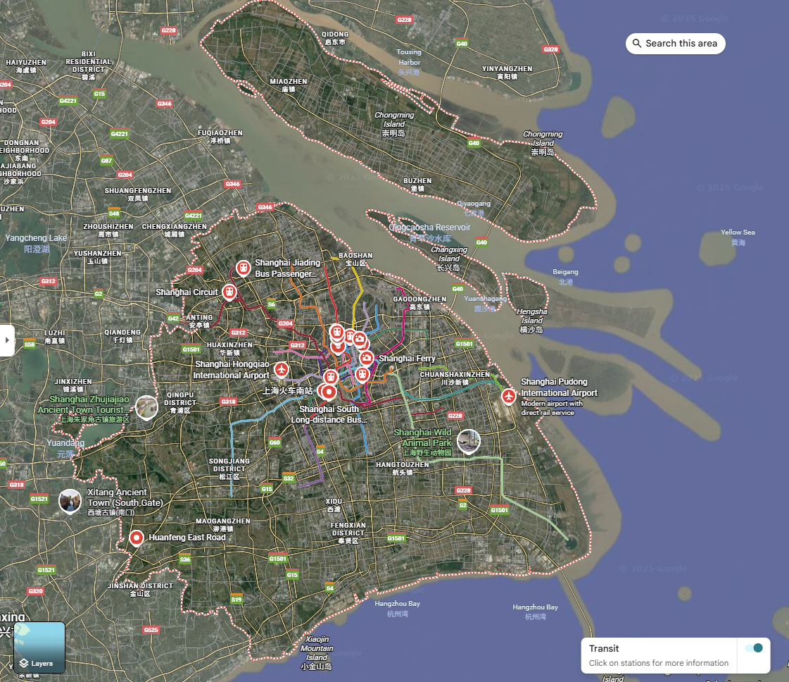
Image source: Google Maps Transit – Shanghai urban and suburban bus routes.
The Google Transit bus-line map complements the stop-based analysis by illustrating the route structure of Shanghai’s bus system. Several features stand out:
- A dense radial web centred on the inner districts of Puxi and the Hongqiao–Xujiahui–Lujiazui axis, where multiple overlapping routes follow major arterials.
- Ring-like corridors roughly aligned with the inner and middle ring roads, supporting tangential movements that do not pass through the historic core.
- Strong east–west and north–south trunks extending into Pudong and towards satellite towns, where routes run along major expressways and only gradually branch into local grids.
- Noticeable gaps over water and non-urban land (e.g. wetlands, port zones, agricultural areas), which correspond to the empty regions seen along the edges of the analytical boundary.
When juxtaposed with the KDE and NN maps, this line map helps explain why coverage remains high despite relatively modest overall density:
- The presence of many overlapping routes in the core produces very short NN distances and high KDE values.
- Outermost corridors are long and relatively straight, with stops spaced further apart, which shows up as the long tail in the NN histogram but contributes little to the coverage ratio because many of these segments run through low-density or industrial land.
7. Data limitations and interpretation
For Shanghai, several data and visual limitations are particularly important:
- The city boundary represents the full municipality, including large areas of water, wetlands, agricultural land and outlying islands. These regions contain few or no bus stops, which strongly affects density and coverage metrics.
- Because all polygons are retained, the analysis incorporates the entire municipal territory rather than only the built-up core. This yields lower density and coverage figures compared with cities whose administrative boundaries align more closely with their continuous urbanised areas.
- The three main maps (stops, Euclidean coverage, network coverage) look very similar because the core is so densely served that buffers overlap into an almost solid mass. This can give a misleading impression of uniformly high accessibility; the numerical indicators (47.5% vs 15.8% coverage) reveal much stronger contrasts.
- Bus stops close to metro or suburban rail interchanges are mapped as points only; the analysis does not explicitly model multimodal accessibility, which is crucial in a metro-rich city like Shanghai.
Despite these limitations, comparing Shanghai to New York, Singapore and Amsterdam under a consistent 500 m coverage and NN framework yields several robust insights:
- In terms of basic spatial access (share of land within 500 m of a bus stop), Shanghai performs broadly similarly to the other cities, once non-urban land is taken into account.
- Shanghai’s internal structure – a combination of radial trunks, ring roads and emerging sub-centres – is clearly reflected in the KDE and NN patterns, differentiating it from Singapore’s island-wide uniformity and Amsterdam’s compact monocentric form.
- The city’s rapid outward growth generates a dual structure: very dense inner-city service with short NN distances, alongside more sparsely served fringe corridors. This suggests that future improvements could focus on filling gaps in newly urbanised areas and rationalising overlapping routes in the saturated core.
Overall, Shanghai’s bus system, as captured by this dataset, sits somewhere between European compact-city density and North American metropolitan scale. Recognising the limitations of the boundary and the visual similarity of the maps is essential for drawing fair comparisons and for grounding any policy recommendations that might be derived from this analysis.