New York City
1. Bus stops and boundary
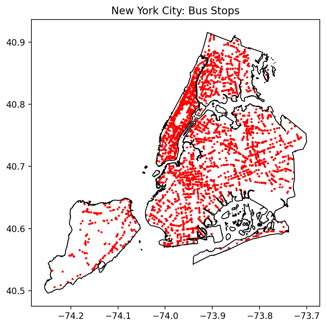
New York City contains 3,381 bus stops distributed across its five boroughs.
The spatial distribution in this map highlights several clear patterns:
- Manhattan exhibits the highest point density, with evenly spaced stops following the street grid.
This pattern reflects Manhattan’s extremely high block density and intensive surface transit demand. - Brooklyn and Queens show wide coverage but with more irregular spacing, consistent with more diverse street networks and lower building density.
- The Bronx displays a moderate density of stops, particularly along major north–south corridors.
- Staten Island is much more sparsely served, aligned with its car-oriented development pattern.
These geographic differences already hint at variation in accessibility, later confirmed by the nearest-neighbour and KDE analysis.
2. 500 m Euclidean coverage
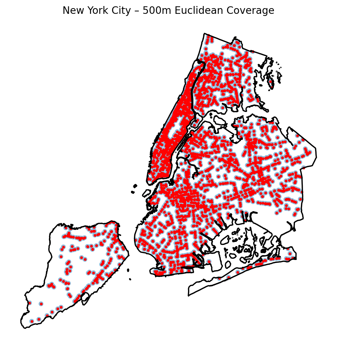
Approximately 56.1% of New York City lies within a 500 m walking distance (Euclidean) of a bus stop.
Interpreting this map:
Key insights
- Manhattan achieves near-universal coverage, especially below 110th Street.
The combination of narrow blocks and many parallel bus corridors makes almost the entire island fall within a 500 m radius. - Brooklyn and Queens show significant coverage gaps, especially in low-density or industrial areas.
- Staten Island once again lags behind, with large residential zones beyond walkable bus access.
Why does NYC not reach >70% coverage?
Even though stop density is relatively high, New York covers a very large land area (1,362 km²).
Large parks, airports, industrial areas, low-density districts, and waterfront zones reduce the overall coverage ratio.
3. 500 m network-based coverage
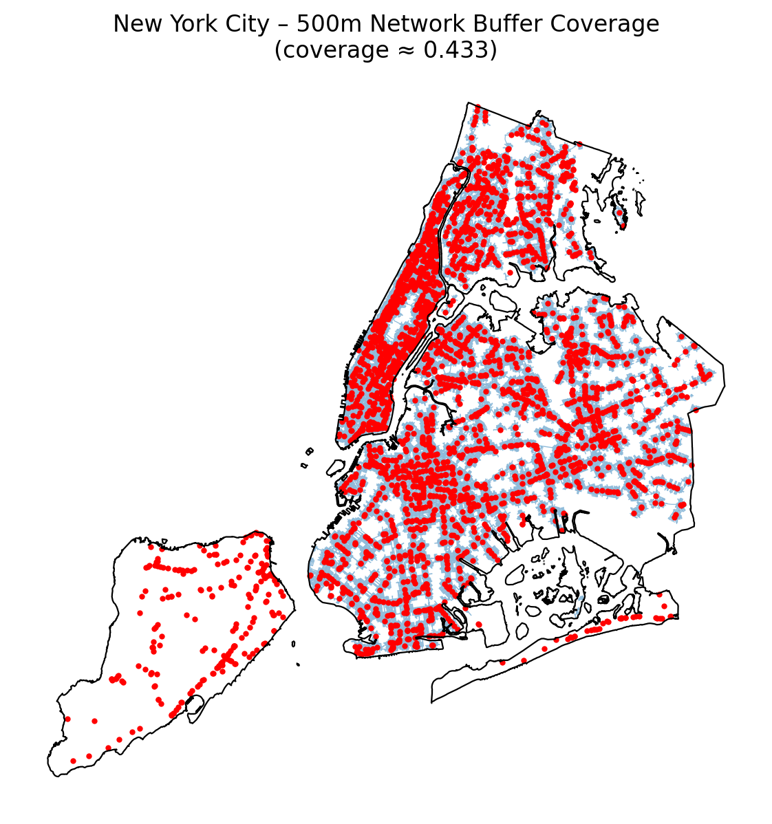
Using the street network instead of straight-line distance gives a more realistic view of where people can walk to a stop within 500 m along walkable paths.
Overall result
- The network-based coverage ratio is about 43.3%, notably lower than the 56.1% from Euclidean buffers.
- In other words, once we respect the actual street layout, around one sixth of the land that looks “covered” in Euclidean space is not reachable within 500 m of walking.
What changes compared with Euclidean coverage?
- Water bodies and expressways become more visible barriers:
- Areas near waterfronts or separated by highways may fall inside a 500 m circle but require long detours along bridges or underpasses.
- These zones shrink in the network-based map.
- Areas near waterfronts or separated by highways may fall inside a 500 m circle but require long detours along bridges or underpasses.
- Manhattan remains highly accessible, but coverage along the edges (Hudson/East River waterfronts, large parks such as Central Park) is thinner once only real walking paths are allowed.
- Brooklyn and Queens show larger uncovered pockets, especially in:
- industrial waterfronts,
- low-density residential districts with discontinuous street grids.
- Staten Island looks particularly constrained: cul-de-sacs, limited bridges, and hilly topography all reduce network-based walking access.
Interpretation
The comparison between the Euclidean and network maps highlights that:
- Street connectivity is as important as stop density.
Even with many stops, disconnected or barrier-heavy street networks reduce effective walking access. - NYC’s overall accessibility is uneven.
Dense, well-connected grids (Manhattan, parts of Brooklyn/Queens) are robust under both measures, while peripheral and car-oriented areas lose much of their apparent coverage when we switch to a realistic walking metric.
4. Kernel density heatmap
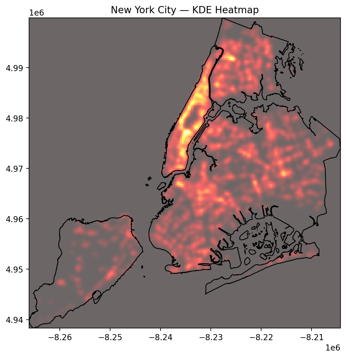
The kernel density estimation (KDE) heatmap visually emphasises intensity of bus stop clustering, independent of administrative boundaries.
Key spatial patterns
- The brightest concentration runs down the spine of Manhattan, reflecting the street grid’s dense transit corridors (e.g., Madison, Lexington, Broadway, 1st–5th Avenues).
- Other strong clusters appear in:
- Downtown Brooklyn & Brooklyn Heights
- Western Queens (Astoria, Long Island City)
- The Bronx South and West
- Downtown Brooklyn & Brooklyn Heights
Why does Manhattan stand out so strongly?
- Small block size → more intersections → more stop placement opportunities
- High population and job density → need for very frequent bus service
- Complementary to subway network → bus feeders and crosstown routes fill subway gaps
- Legacy streetcar routes → many modern bus lines follow historic trolley lines
KDE complements the raw stop map by showing relative clustering intensity, whereas the 500 m coverage (Euclidean and network-based) shows accessibility of land area.
Together, these layers reveal both where stops are and how intensively they are concentrated.
5. Nearest-neighbour distances
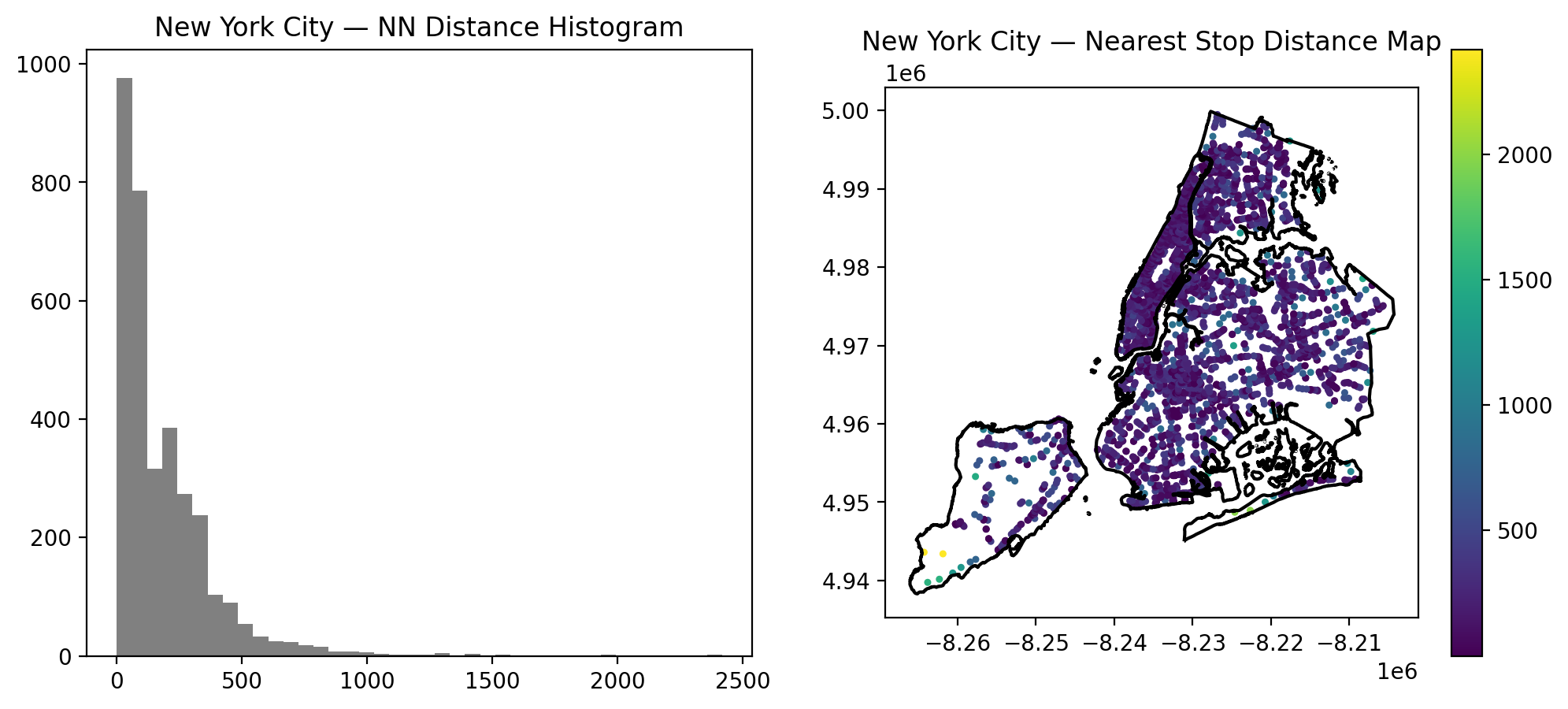
Nearest-neighbour (NN) analysis quantifies how close the typical bus stop is to the next one.
The distribution is heavily right-skewed:
Statistics (from summary table)
- Mean distance: 183 m
- Median distance: 108 m
- 90th percentile: 394 m
- Maximum: > 2.4 km (mostly Staten Island or fringe industrial areas)
Interpretation
- Most bus stops in NYC are very close to each other (100–200 m).
This reflects high service frequency and redundancy in dense boroughs. - The long-tail of the histogram represents isolated stops in low-density areas.
- Staten Island and parts of eastern Queens contribute disproportionately to the high-distance outliers.
Spatial NN map interpretation
The right-hand map shows: - Dark purple points (short NN distance) → Manhattan, Downtown Brooklyn, LIC
- Green/yellow points (long NN distance) → outer borough peripheries, Staten Island
NN distance complements KDE by quantifying spacing regularity; KDE identifies clusters, while NN identifies local gaps.
6. Manhattan bus network (high-density reference)
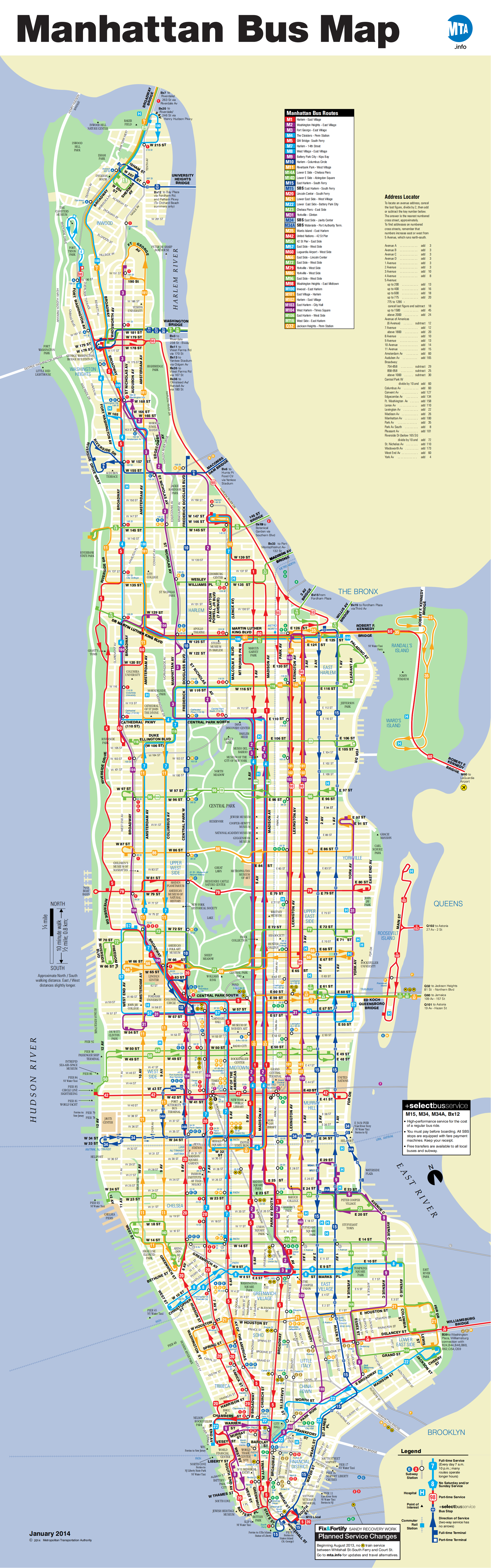
Image source: NYCMap360°, Official Manhattan Bus Map (NYC Bus Maps).
Manhattan’s bus map illustrates why it dominates NYC’s clustering patterns:
- Dozens of north–south avenues support parallel bus corridors.
- Frequent crosstown routes fill gaps between subway lines.
- The grid structure allows extremely consistent spacing of stops — often every 2–3 blocks (120–180 m), matching our calculated NN statistics.
This map visually reinforces the interpretation from all previous figures:
Manhattan is the core of NYC’s bus accessibility system, both in density and coverage.